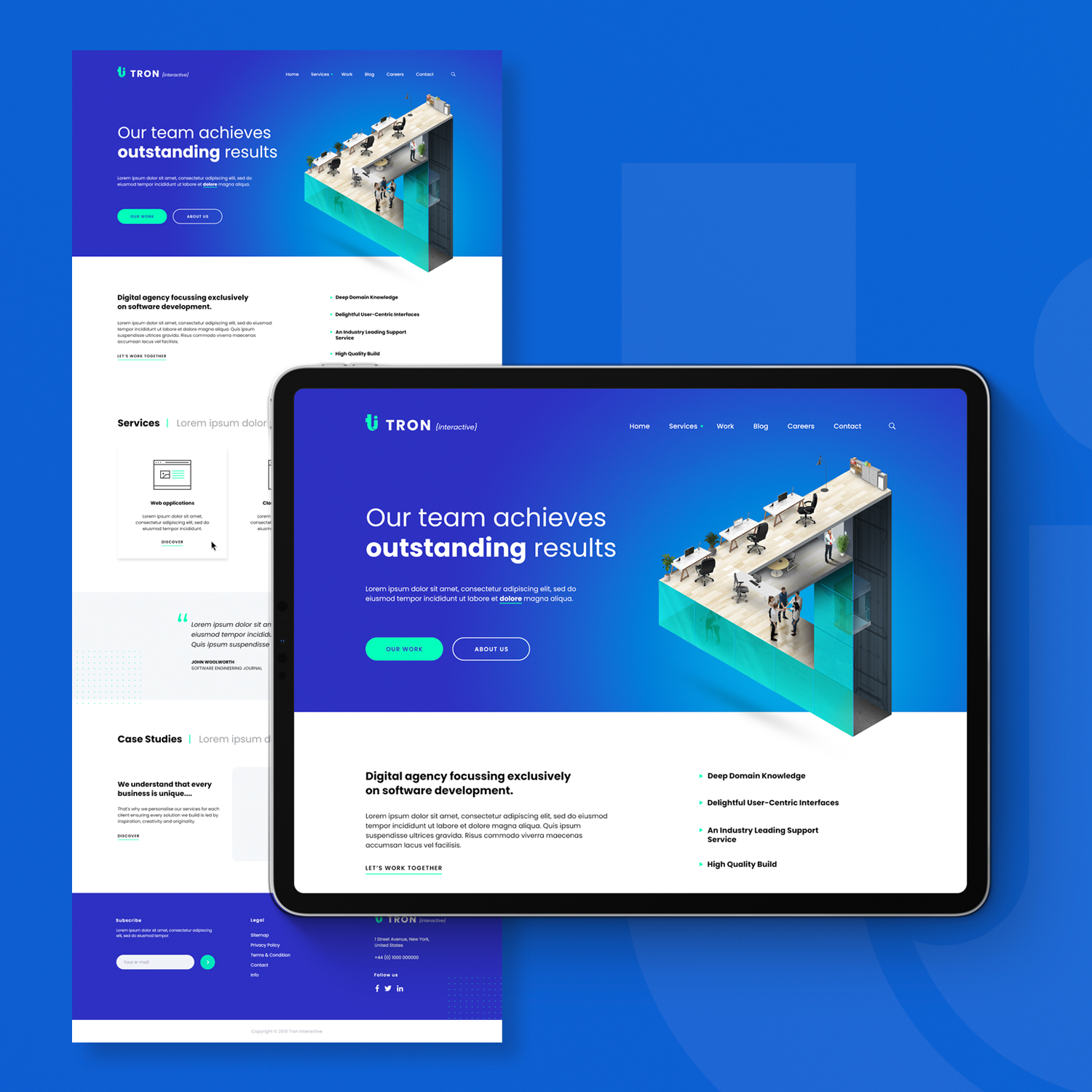
For the Tron project, our team was tasked with designing a creative and visually stunning website for a digital marketing agency. Working collaboratively, we incorporated the client's brand guidelines and inspiration from their past projects to create a design that would showcase their creativity and expertise in a way that would stand out from the competition.
One of the standout features of the design is a custom illustration that features a Penrose triangle with business people in it. The client wanted an image that would represent their innovative and creative approach to digital marketing, and the Penrose triangle was a perfect choice as it represents the idea of the impossible becoming possible. We worked closely with an illustrator to create a unique version of the triangle that incorporated elements of the client's brand.

Another important aspect of the project was balancing creativity with usability. While the client wanted a visually impressive design, it was also essential that the website would be easy to navigate and provide a great user experience. To achieve this, we created a clear and intuitive navigation system and used a simple grid layout to organize the content. The use of bold typography and bright colors helped to guide users through the website and draw attention to important information.
Overall, we are very proud of the final design for the Tron project. It achieves the client's goals of being creative and visually impressive, while also providing a great user experience that makes it easy to explore the client's services and projects. We are excited to see how the website performs and how it helps the client's business grow.

