Natur House Beskidy
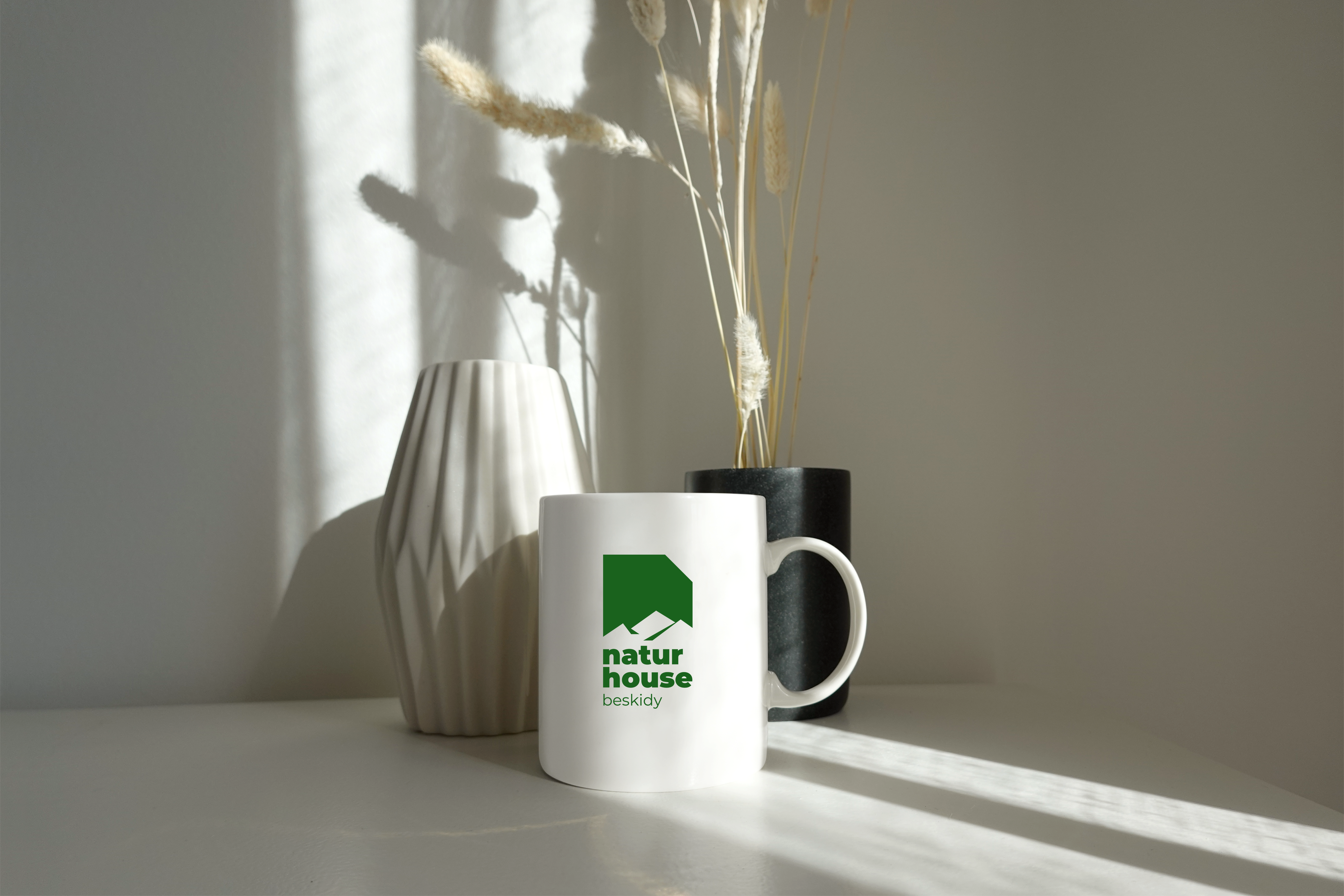
We had a pleasure of designing a logotype for a resort in Beskidy called Natur House Beskidy. This stunning resort is located in the mountains and offers breathtaking views and a relaxing atmosphere. It is built from "moon wood" Holz100 (free of wood preservatives and glue). Our task was to create a logotype that captured the essence of this beautiful place and reflected its natural surroundings.
Our team decided to use green as the primary color for the logotype, as it is a color that is commonly associated with nature and the environment. We incorporated the mountains into the design, using simple yet elegant lines to create a striking image.
We wanted the logotype to be easily recognizable and memorable, while also conveying the feeling of peace and tranquility that the resort provides. We believe that our design accomplishes this by using clean and minimalistic elements, combined with the natural green colour.
The logotype will be used across all marketing materials and signage for the resort, ensuring that it is easily recognizable and associated with the beautiful location. We are proud of the work that we have done in creating this logotype and believe that it is a true representation of our commitment to creating visually stunning designs that have a positive impact on our clients and their audiences.
If you are planning a trip to Beskidy or looking for a relaxing getaway, we highly recommend visiting Natur House Beskidy. We are confident that you will enjoy the beautiful surroundings, stunning views, and peaceful atmosphere that the resort has to offer.


