Project Fear
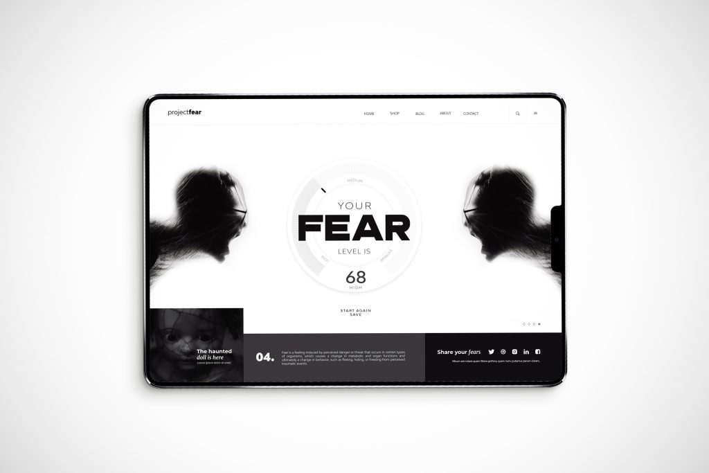
During the challenging times of the Covid pandemic, our studio came up with a unique idea that would help people measure their level of fear. We called it Project Fear, and it was a design concept for a website that aimed to provide people with a better understanding of their emotions during these unprecedented times.
To achieve this goal, we designed the website with a minimalist approach, using black and white colours to create a simple and modern look. The black elements added a touch of darkness and gloominess to the website, which reflected the uncertainty and fear that many people were experiencing during the pandemic.
The website concept was designed to be easy to navigate, with clear and concise instructions that allowed users to measure their fear levels accurately. The interface was user-friendly, and the process was straightforward, allowing people to access the information they needed quickly.
As a graphic design studio, we understood the importance of visual elements in conveying emotions, and that's why we incorporated various design elements that helped to reflect the fear and uncertainty that many people were experiencing. The website's visuals were carefully crafted to communicate the message effectively, and the use of black and white colours helped to create a somber and serious tone.
Our goal was to show a concept of a tool that could help people cope with their fear and anxiety. It was a testament to the power of design in helping people navigate difficult times.


